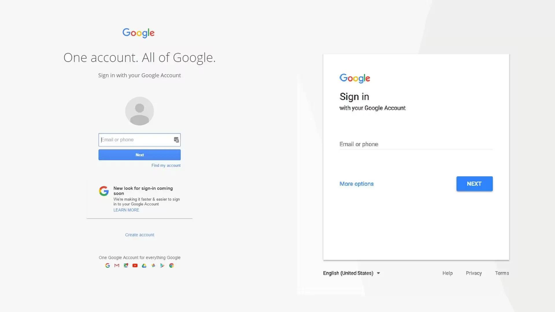
Websites and internet services usually look very different when viewed between desktop and mobile. This is due to limitations of mobile devices including screen size, processing power, and bandwidth.
For some time, Google is updating its websites and services to what it calls “Material Design” that sports a new, cleaner UI that works well with mobile devices as well as desktop. While many, if not all, of Google’s services has switched to Material Design, its Sign-In page is not one of them.
Google has updated its Sign-In pages on mobile devices to a new, cleaner version, incorporating elements of material design. However, this change did not make its way to the web version, at least not for everyone.
Through its support forums, Google recently revealed that it is planning to redesign the web sign-in page with a fresh look, which is a lot like what is in place on mobile devices. It will feature elements of material design and an overall cleaner look.
According to Google, the new sign-in page will:
- Have a cleaner, simpler look.
- Make the sign-in process faster.
- Be consistent across computers, phones, and tablets.
The change is only visual and the functionality will still be the same. Users will still need to enter their email address first, followed by their password and, if enabled, two-step authentication. This move by Google is not a surprising one, as the company has previously said that they believe mobile is the future, and that they will be making mobile more of a priority.
According the Google’s support page, the change to the new UI will be rolling out over the next few weeks, so do not panic if your sign-in page suddenly looks different. The company is also showing a small notification on the current sign-in page to notify users of the coming change. Also, you might still see the old sign-in page if you use an older version of a browser or you have turned off JavaScript.
