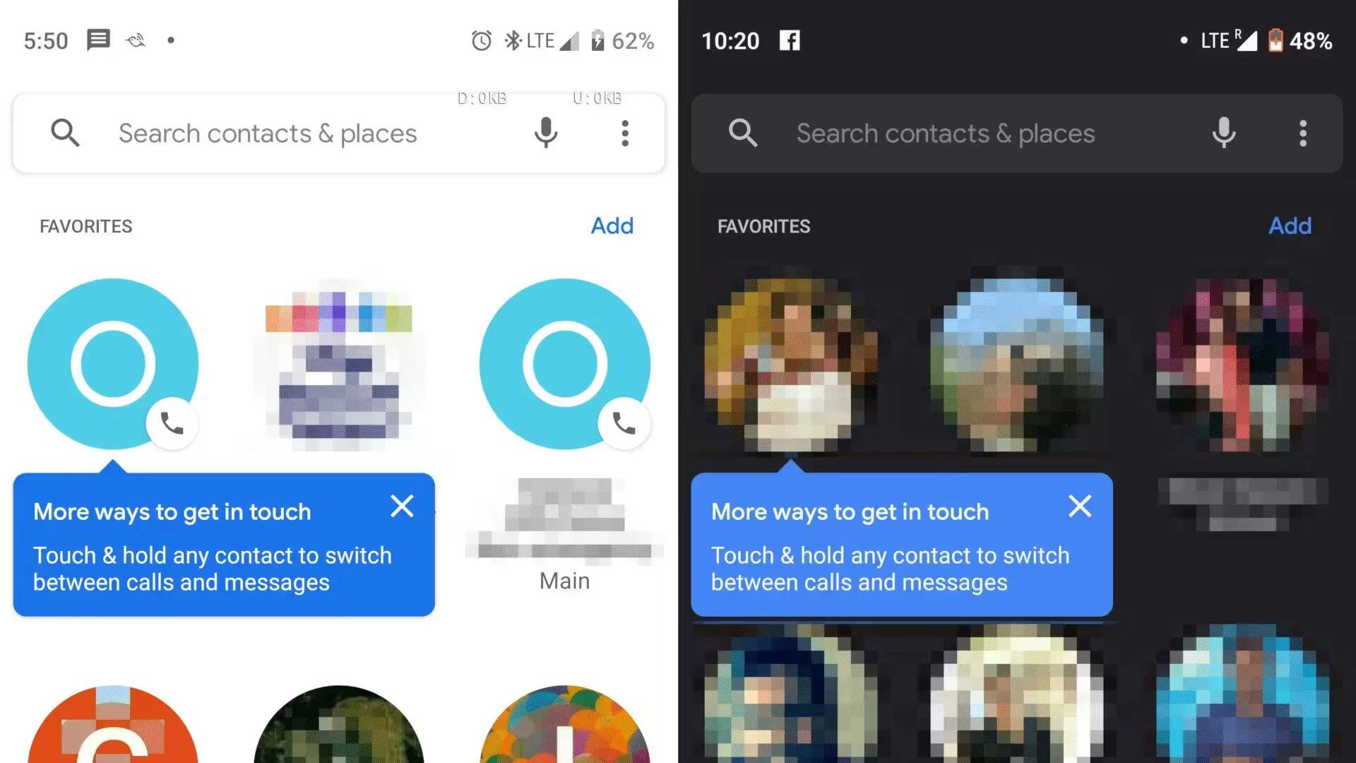
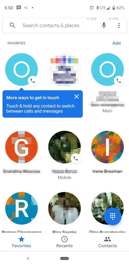
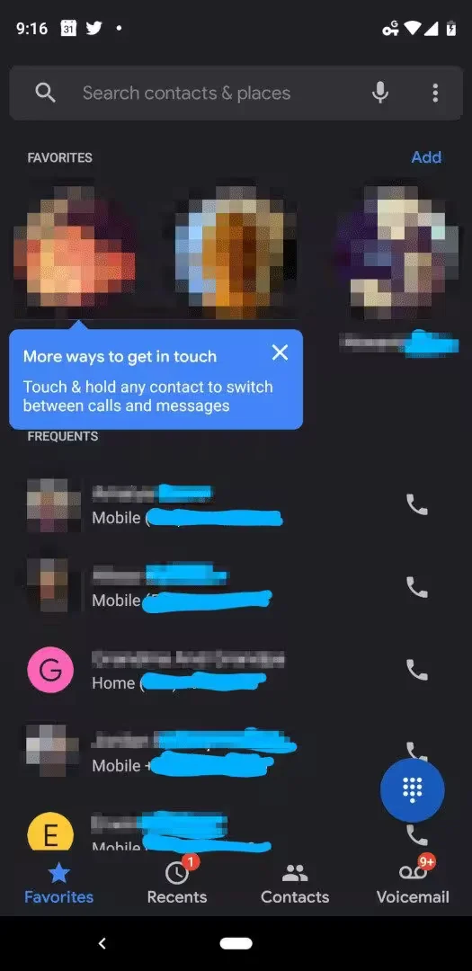
For some time Google has been working to redesign the Favorites tab for Google’s Phone app. The new UI was first leaked in August and it has been received positively by many users. Now, the new UI was done and Google is rolling out the redesign to users’ phones.
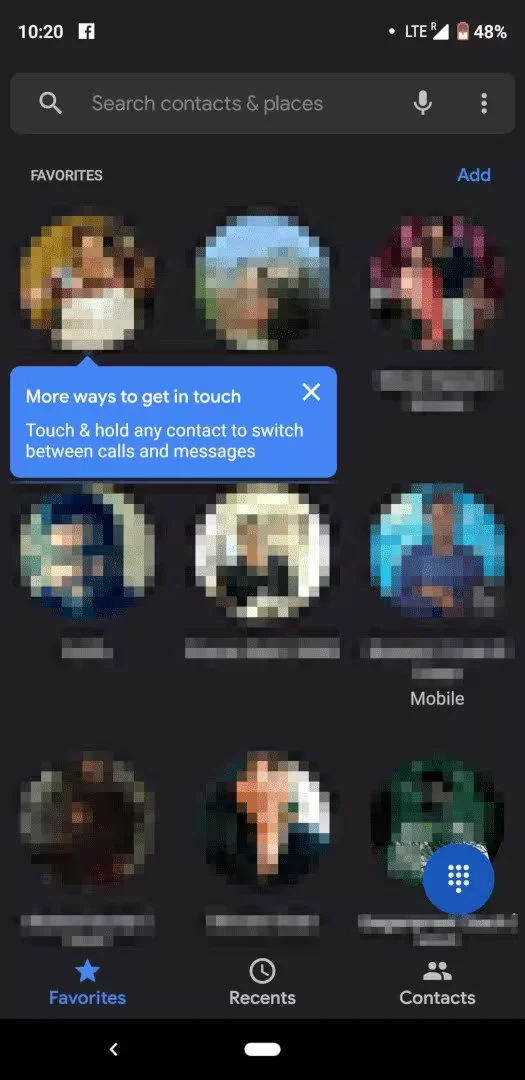
The main change here is obviously the circular icons for contacts marked as Favorites. The previous interface had been around for a while and was starting to look a bit dated, so this is a welcome redesign.
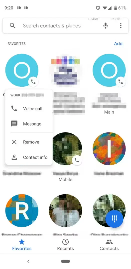
Once installed, the app will show a blue popup which explains the interface and how users can switch between calls and messages by performing a long-press on the contact icon. The UI is also updated to have a dark mode. Scrolling past the Favorites will reveal a list of frequently-contacted numbers that Google thinks you might want handy as well.
This rollout appears to be server-based, with the redesign being visible several users even without having updated to Phone v27. Let us know if the new UI has appeared on your device.
