Last week, Twitter has pushed a controversial update for iOS users, which shows “Promoted Accounts” in your main timeline. This week, the microblogging service pushed out another update to its iOS app that features responsive design tweaks, meaning iPhone, iPad and iPod touch owners will see a uniform user experience across their devices.
This new update will make the user experience on larger displays almost identical to that on iPhone. It also brings many of the features that were previously iPhone-only.
As noted on Twitter’s official blog, iPad users will see noticeable changes in the app. Owners of Apple’s tablet can now create and view tweets using Twitter’s retooled quoting system, browse trending topics and visit product and place pages, among other features previously reserved for iPhone.
The new Twitter interface on iPad is essentially a scaled up version of the iPhone interface, which is not always a good thing. In portrait mode, it looks okay, but in landscape mode, there is an abundant amount of blank white space on either sides of the actual timeline.
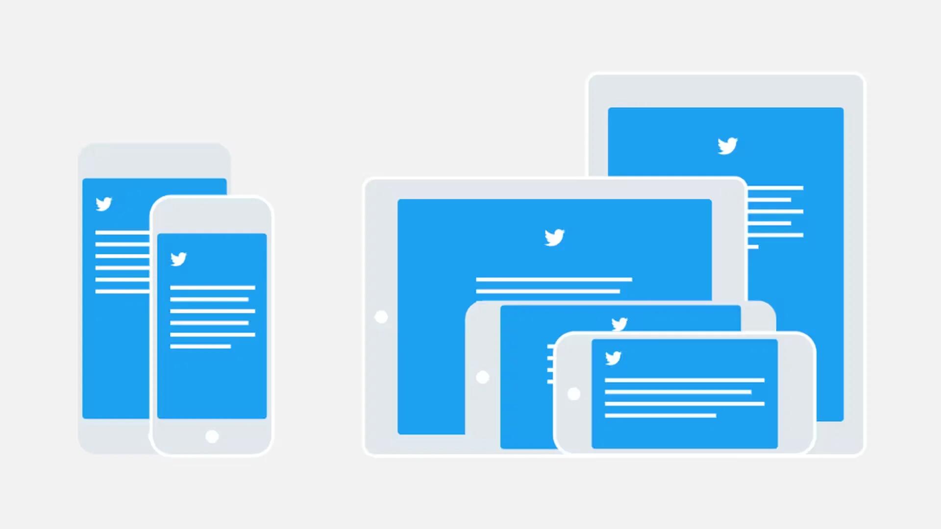
Twitter explained its reasoning for unifying the design of its iOS app in a blog post. The company pointed out that it has taken a “responsive philosophy” with the new interface. In implementing this new design philosophy, Twitter is concentrating on specific characteristics: device type, orientation, canvas, size class and typography. The company has also developed a framework for easily maintaining a consistent interface on multiple sized devices.
Reading your Timeline should be a great experience on any iOS device, no matter the screen size or orientation. For this reason, we must consider different devices and their characteristics. So we built our own responsive system, starting with the typographic elements that make a great reading experience, and built from there.
- Characteristics we look at include:
- Kind of device (phone or tablet)
- Orientation
- Canvas (size of the current view)
- Size class (whether the canvas is small and compact or broad and expansive)
- Typographic settings and constraints
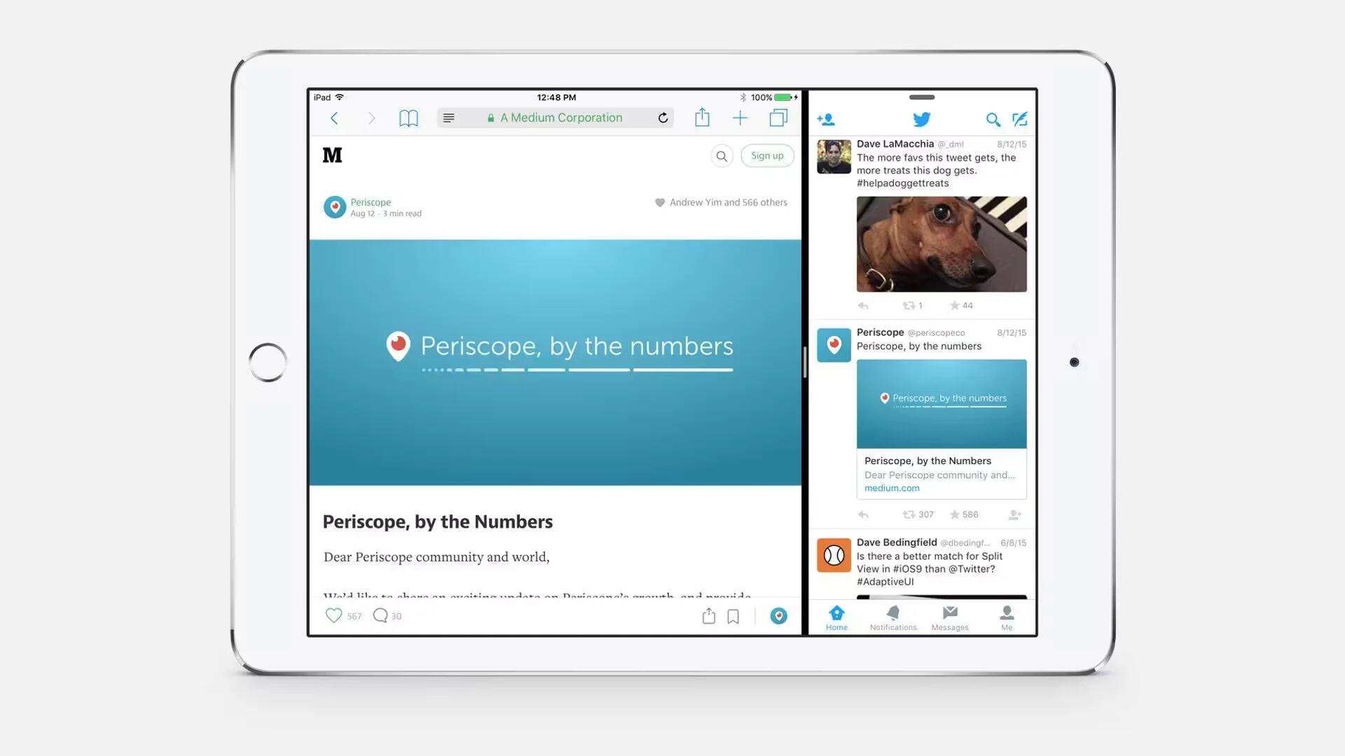
This means Twitter can automatically adjust itself to suit the device you are using, and the settings you have optimized on that device. This new responsive design is very useful, as iOS 9 users can take advantage of Split View and Slide Over multitasking, which lets you to run two iOS apps side-by-side for the first time. That means you can use the Twitter app alongside something like Safari, and no matter how much space you give it, its UI will adapt to provide you with a decent browsing experience.

With the unification, however, come some benefits. Features that were previously available only on the iPhone are now available on the iPad. This includes Twitter’s new quote functionality, which previously was unsupported on the iPad.
The new Twitter for iPad update is rolling out now on the App Store. It appears, however, that the actual interface is not included in the update via the App Store and is rolling out slowly on an account-by-account basis.
Source: Twitter Blog
